Claro Telecom Mobile App
Redesigned core journeys of the Minha Claro app, reducing friction in high-frequency tasks and improving self-service efficiency—contributing to fewer support requests and a more scalable product experience.

PROBLEM
Simplifying Self-Service in a High-Complexity Telecom Product
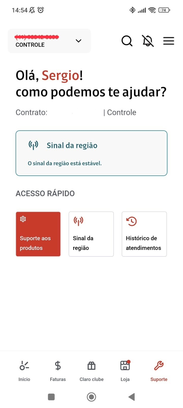
As the product evolved, the experience failed to keep up with its growing complexity. Navigation became fragmented across multiple services, billing and plan information were often confusing, and critical flows demanded a high cognitive effort from users. In addition, inconsistencies between different user types and services further degraded the overall experience. As a result, users struggled to complete basic tasks, support demand increased, and the efficiency of self-service journeys dropped significantly. This was not simply a UI issue—it was a structural problem.
Approach
1. Reframing the Problem
Instead of optimizing screens, I focused on how the system was organized.
Mapped end-to-end journeys (billing, usage, support)
Identified friction across different user scenarios
Analyzed where users were getting blocked or confused
KEY INSIGHT:
Users weren’t failing because of individual screens—but because the structure didn’t match their mental model.
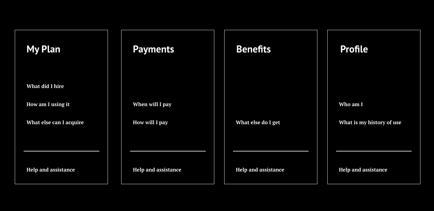
2. Structuring the Experience
Redesigned the information architecture to reduce fragmentation:
Grouped related services into clearer categories
Created a more predictable navigation model
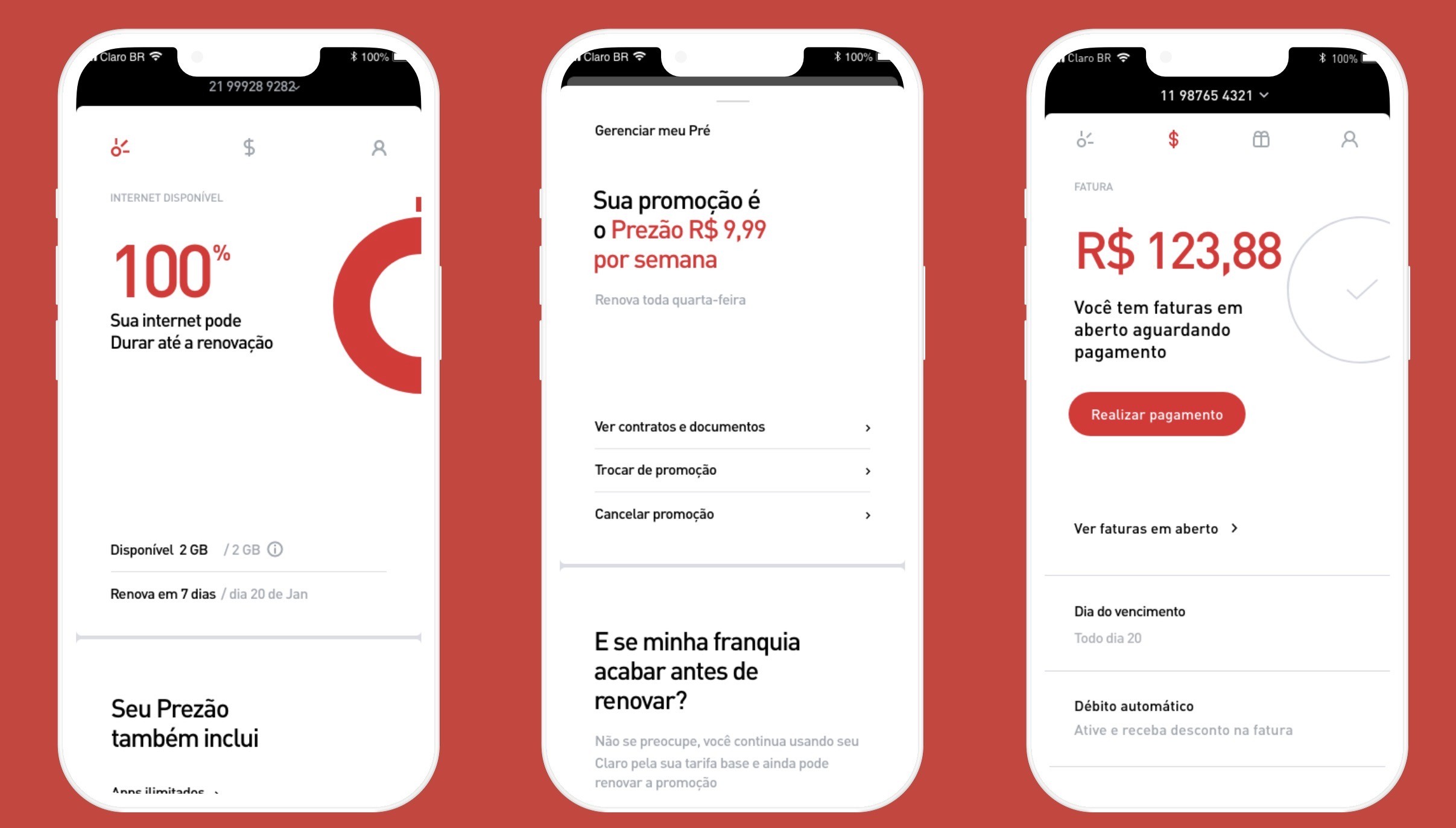
Prioritized high-frequency actions (e.g., pay bill, check usage)
3. Simplifying Core Flows
Focused on the most critical journeys:
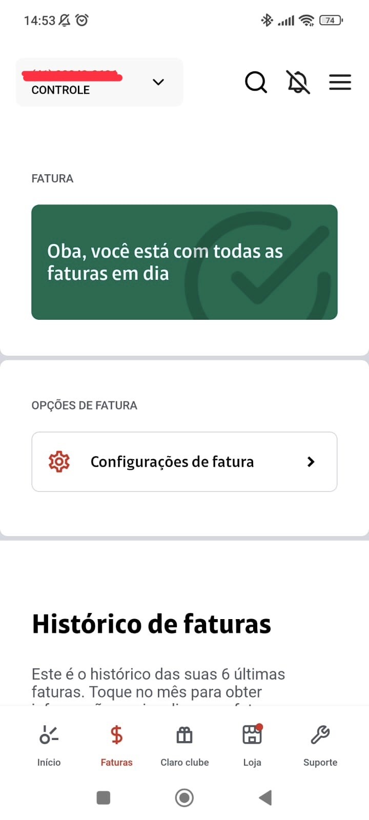
Bill payment
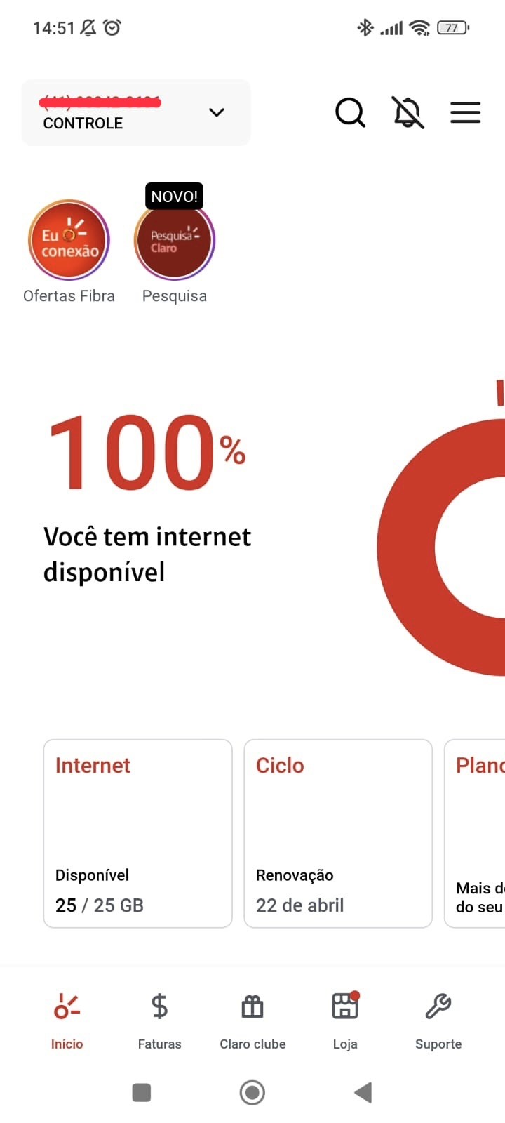
Usage tracking
Plan management
Improvements included:
Reducing unnecessary steps
Clarifying content and hierarchy
Highlighting key actions at the right moments
4. Iteration & Validation
Before launching the app for all the users we did a moderated usability testing to validate the concept. We wanted to understand if the user was comfortable with the change from the old to the new app and if he could find all the information that he needed at any given point.
DEMOGRAPHIC:
3 users that had acquired the monthly plan;
4 users that had acquired a hybrid between pre-paid and monthly;
3 users from the pre-paid modality.
TASKS AND GOALS
The login and onboarding flow;
Data consumption information;
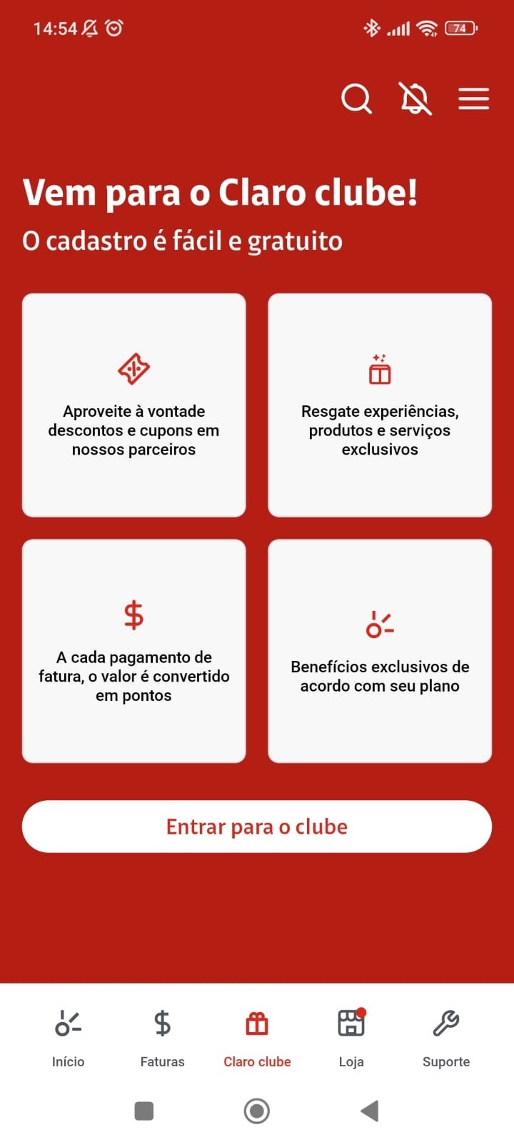
The understanding of the purpose of the 4 main areas of the app (My Plan, Payment, Benefits and Profile);
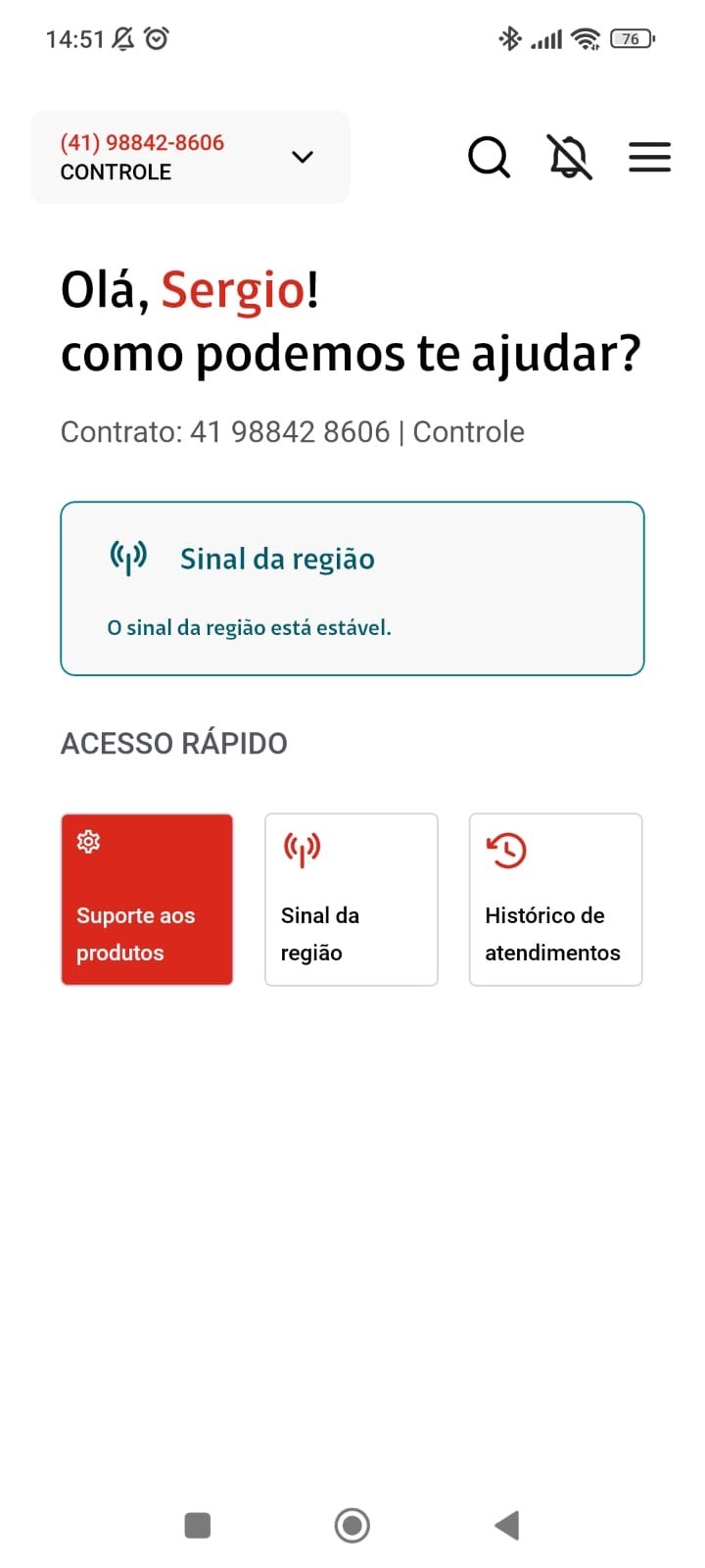
What would the user do if in need of help;
If they would prefer the new app over the old one.
The solution
A more structured and scalable experience that:
Simplifies navigation across multiple services
Improves clarity of billing and plan information
Reduces friction in high-frequency tasks
Supports future growth without increasing complexity
Results and lessons learned
After expending almost a year on the project, the main lesson that the team learned was that simplicity was almost always welcome, except when dealing with payment and the financial aspect of the user plan.
Results (compared to the previous year):
Increase of 25% on user rating in the App Store;
Increase of 40% on search about products and services inside the app;
Reduction of 32% in contact rate on the call center.
Lessons Learned:
The users willingly migrated to the new app if it meant a faster access to their information;
Although we obtained success with one of the goals (contact rate), the NPS of the app took of a hit of 10%. The users mentioned that alhough the information was easily accessed, sometimes it lacked detail compared to the previous version of the app;
The users would give a score on the app based on the quality of the telecom service and not necessarily about the app;
When you deal with a user base of over 5 million, the quantitative data is as important as the qualitative obtained on user testing.
25%
User rating increase in the App store
90%
Understood their data at a glance.
56%
increase in Monthly active users.
32%
reduction in contact rate for support tickets MoM.