
Financial Experience for E-commerce sellers
How I redesigned an E-commerce platform financial experience to close a transparency gap that was generating thousands of support tickets a month — and ultimately cut the contact rate by 60%

PROBLEM
Every month, thousands of sellers thought the company had gotten their numbers wrong
Brazilian e-commerce sellers on Olist receive regular payouts — but those payouts include a tangle of deductions: marketplace fees, IOF charges, shipping costs, penalties, promotional incentives. When the amount hitting a seller's bank account didn't match what they expected, they did the only thing they could: call support.
Month after month, a sizable share of those tickets were coming from the same place — sellers who weren't confused about the rules, they were confused about what they were looking at. The finance screen existed, but it wasn't working. Information was buried, labels were ambiguous, and sellers were doing mental math on their own just to reconcile the numbers.
"The transferred amounts are not well explained. It could be similar to [a competitor's] spreadsheet."
— Seller with R$250k/month in revenue
That quote from a high-value seller said everything. This wasn't a niche problem for small operators — it was eroding trust across the seller base, all the way up to the top. And every unnecessary support call represented a real cost: to customer service capacity, to seller confidence, and to the relationship between Olist and the people running their business on it.
Research & Discovery
Three pain points hiding in plain sight
After the project kickoff, I defined the research strategy with the PM and set clear objectives: understand what information sellers actually need from the finance screen, and where the current experience was breaking down. I combined multiple data sources to build a complete picture before touching anything in Figma.
I dug into support ticket logs, ran an online survey with a broad user segment, and analyzed behavioral data from the existing screen: heatmaps, session recordings, and usage analytics. The heatmap alone was revealing: sellers were clicking on areas that offered no detail, hunting for breakdowns that didn't exist.
Financial information wasn't prominently displayed with clear details. Sellers could see a total — but not what it was made of. Deductions, incentives, and fees were either missing or presented without enough context to make them legible.
CSV reports and invoice tools were nearly invisible. The tools that would have helped sellers reconcile their own numbers were buried in the interface — low visibility, low discoverability, and almost no usage as a result.
Transfer, incentive, and promotional information was scattered and inconsistent. The same financial concept was labeled differently across the order, catalog, and campaign screens. Sellers couldn't build a mental model because the product didn't have a consistent one to offer them.
To go deeper, I conducted 10 user interviews in 4 days — recruited remotely, with participants from different seller segments and revenue brackets. The interviews was comprised of 10 open-ended questions focused on values, motivations, and daily routines. What sellers told me confirmed the quantitative picture: they weren't asking for more data, they were asking for data that made sense in context.


Design process
Clarity over completeness
With the pain points defined, I moved into ideation and prototyping. The core design challenge was editorial as much as visual: the old screen had too much information, not too little. The problem wasn't absence , it was noise. I needed to decide what to surface, what to reveal progressively, and what to remove entirely.
I built a high-fidelity prototype in Figma that restructured the financial view around what sellers actually needed to understand: how much they're receiving, what's being deducted, and why. Key design decisions included:
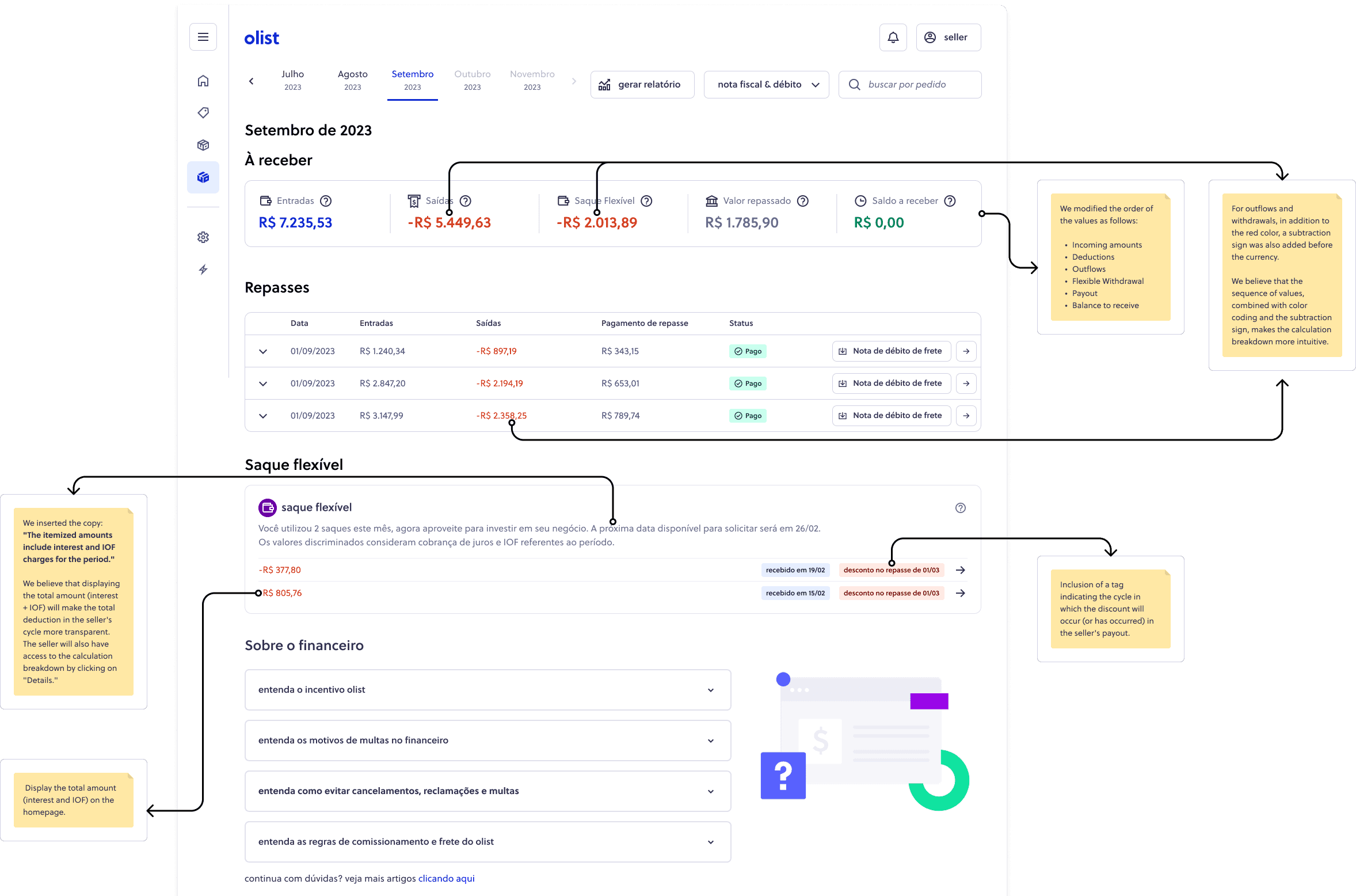
Color-coded value signs: Outflows got a minus sign and red treatment; inflows were clearly positive. Sellers no longer needed to interpret — the visual language did it for them.
Contextual disclosure over always-on clutter: Topics that were confusing the screen but rarely needed were removed from the default view and surfaced only at the moment they became relevant in the user's journey.
Improved copy architecture: Labels were rewritten for precision — especially around deductions. Where users had previously needed to do their own mental math, the screen now explained the calculation directly.
Consistent financial language across the ecosystem: I aligned terminology with the rest of the Olist ERP so that a term seen on the orders screen meant the same thing when it appeared in the finance view.
Two rounds of tests, two very different conversations
I ran two rounds of usability testing — four sessions in the first round, three after iterating on what we found. The testing used the full prototype across realistic task scenarios, with sellers recruited to match our target segments.
The first round surfaced two consistent problems. The copy in certain areas wasn't clear enough — specifically around deductions, where users said they were still doing their own calculations to verify what was being taken out. And there was too much on the screen: information that wasn't used regularly but added cognitive overhead to every session. Both issues had clear solutions, and I returned to Figma before running the second round.
After iteration, the second round was a different experience. Sellers moved through the key flows without hesitation. The calculation breakdowns landed. The deduction logic was followed without prompting. One participant specifically noted that the new layout reminded them of how their own accounting software presented payment summaries — which was exactly the benchmark the high- evenue seller had set for us in research.
The final design of the screen
Learnings and Next steps
A redesign that paid for itself in support savings
The new Finances & Payment experience shipped in December 2023. Within the first measurement period, financial support tickets dropped by 41% — and by the following quarter, the 50% reduction target had been surpassed, landing at 60%. NPS improved by 5 points and detractor comments related to financial confusion fell by 2%. The team had originally projected ~R$15k/month in support savings. The actual outcome beat that target.
The results showed up in specific contact reason categories too. Fiscal note inquiries dropped 60%, bank transfer questions fell 17%, and payment dispute tickets were down 34% — all outcomes that pointed to one thing: sellers finally understood what was happening with their money.
When money is involved, clarity isn't a nice-to-have, it's the product itself.
The 60% reduction in financial support contacts was the number that mattered most to the business. But the insight that's stayed with me is subtler: sellers weren't contacting support because something was wrong. They were contacting support because they couldn't tell if something was wrong. The experience created doubt, and doubt created tickets.
Fixing that required less design and more editing. The instinct in a project like this is to add more explanations, more tooltips, more information. The harder and more valuable work was figuring out what to remove. Context is not just about adding labels, it's about stripping away everything that distracts from the information that actually matters at that moment.
Working on a financial product also sharpened my understanding of how high the stakes feel for users. For a seller doing R$250k a month on the platform, the finance screen isn't a secondary feature — it's core infrastructure for running their business. That weight informed every copy decision, every deduction label, every moment where I had to choose between technical accuracy and human legibility.
Looking forward, the clearest next step is what the data implied: financial information is best understood in context. Surfacing theright numbers at the right moment across the entire Olist ecosystem — on the orders screen, in catalog management, during campaign setup — is where the next round of trust-building happens.
60%
Reduction in financial support contact rate (surpassing the 50% goal)
+5 NPS
Improvement in seller confidence with the finance experience
10
User interviews conducted in 4 days
7
Usability tests across two rounds of iteration